Whether it's a dashboard, a scorecard, or the mobile app, every number is accurately sourced and aligned with your financial and strategic operating plans before it ever renders.
And before we leverage AI for insights, we make sure AI is trained on the right data. This is where decades of experience — working alongside financial experts in the venture capital world — come to light.
Today, anyone can generate a dashboard with AI in minutes. But the chart was never the hard part—it's connecting trusted data, choosing the KPIs that actually matter, and aligning your team around them.
You don't need another dashboard. You need one you can trust.
Every example below is built with the Aligned KPIs™ Method. These are illustrations, not templates — each implementation is tailored to the organization's goals, data, and operating plan.
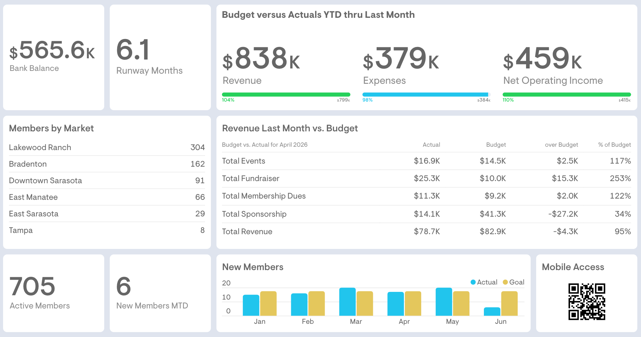
Projected on the big screen at the monthly board meeting, this single view puts bank balance, cash runway, and revenue versus budget alongside membership by market and new-member trends.
The QR code provides mobile access to board financials and other materials right on the members' phones.
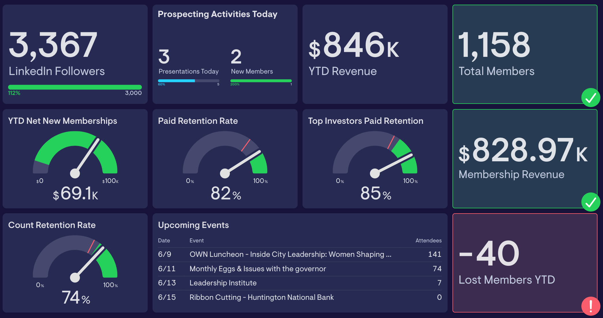
A live read on the health of the membership base: LinkedIn followers vs goal; total members and membership revenue, net new memberships, paid and count retention rates, and lost members YTD — with upcoming events and prospecting activity in the same view.
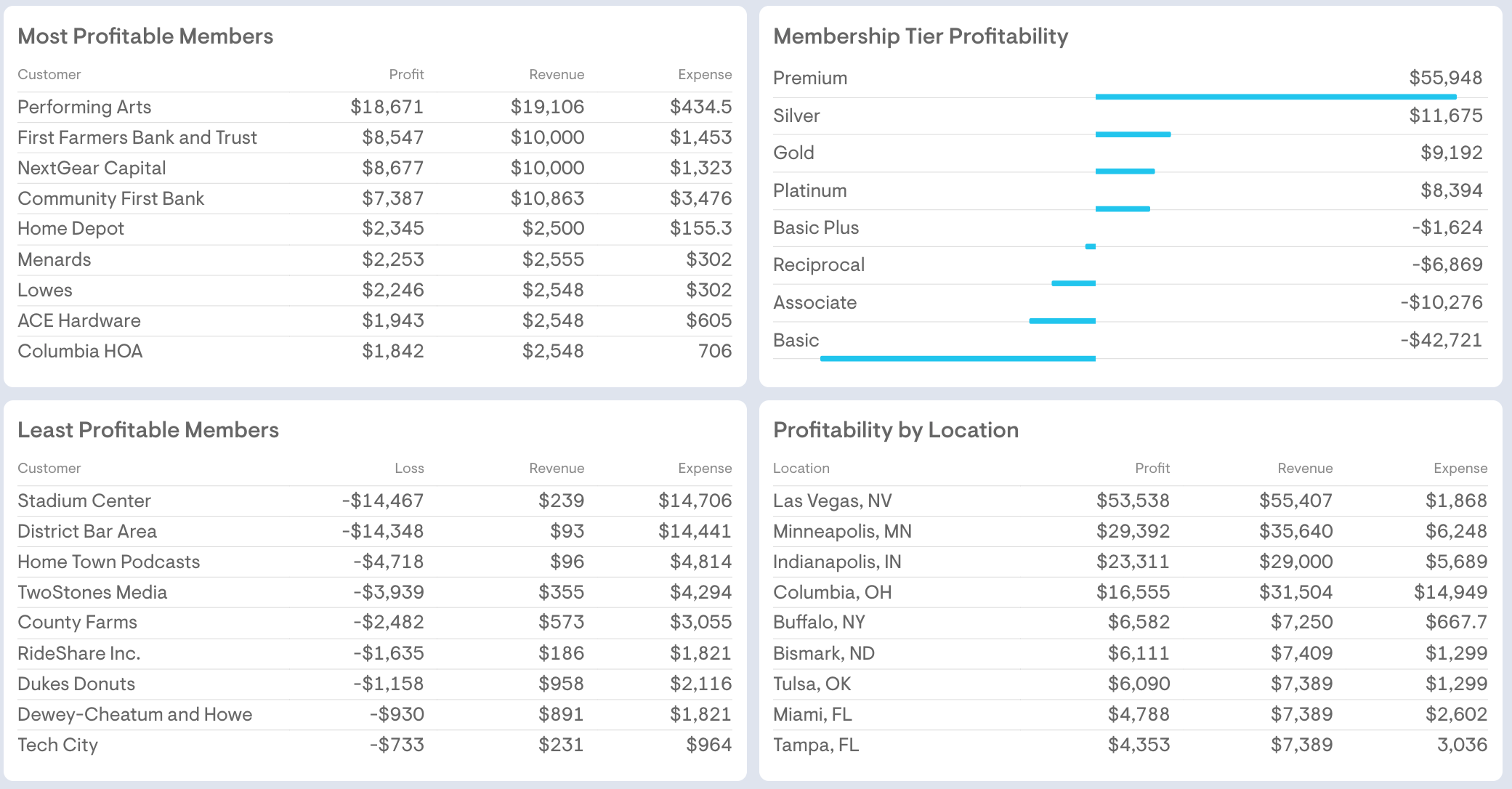
Derived from a deep dive into at least two years of financials and expense allocations, real insights appear. This dashboard shows where the margin really comes from: most and least profitable members, profitability by membership tier, and profitability by location — so leadership can see which relationships and segments need strategic attention.
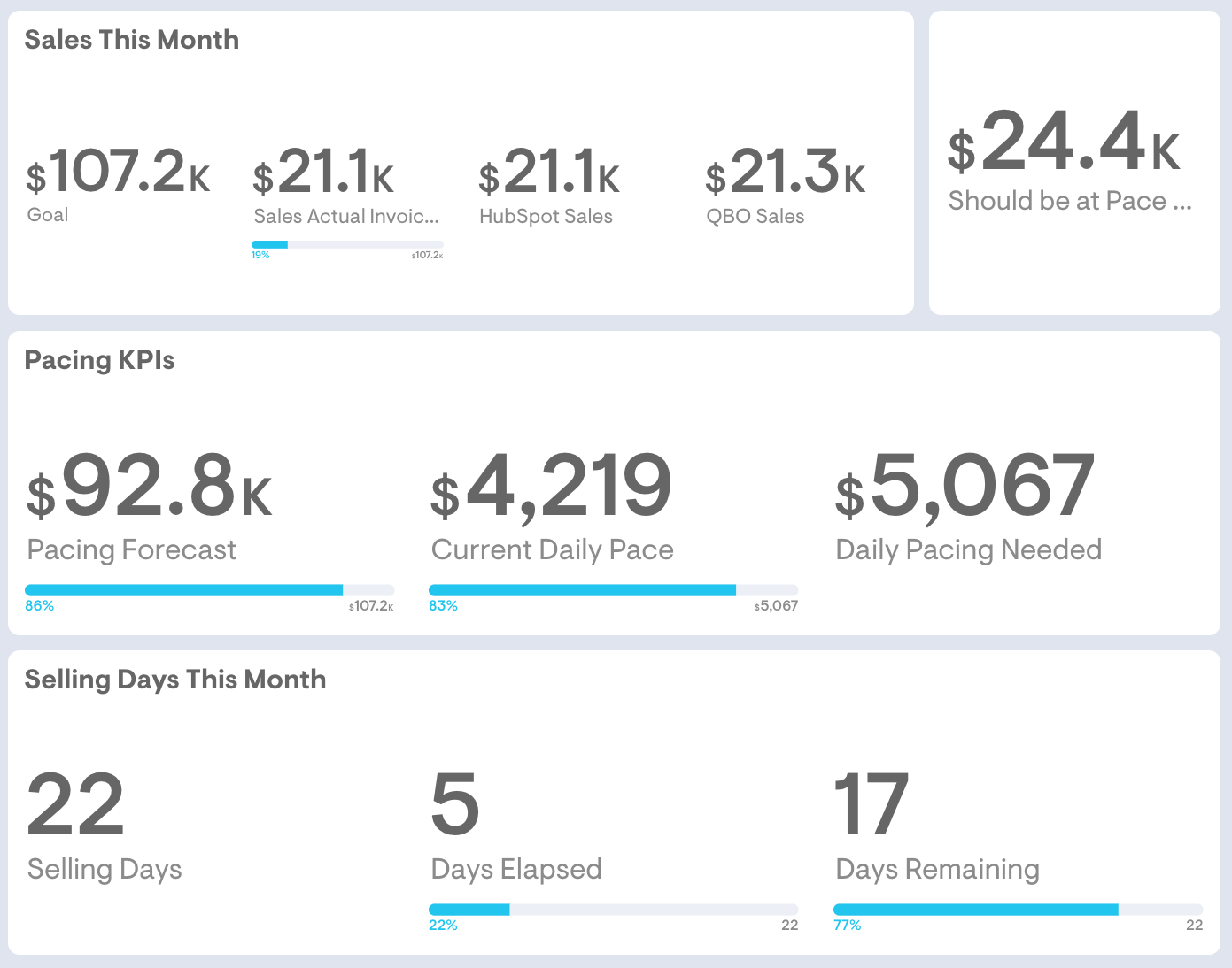
Tracks the monthly membership sales in flight: sales against goal, pacing forecast, current daily pace versus the pace needed to hit target, and selling days remaining — so the team knows exactly where it stands before the month closes.
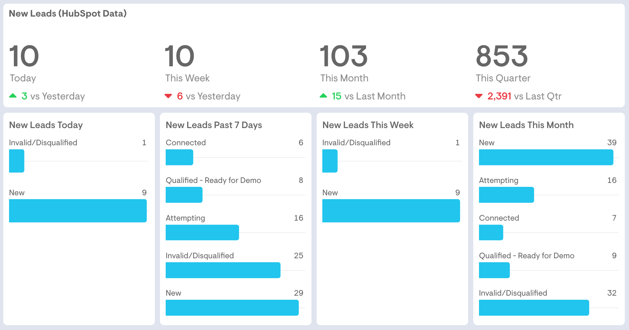
Pulls new leads from your CRM or membership system — HubSpot in this example — and breaks them down by day, week, month, and quarter, with status across the funnel from new and attempting to connected and demo-ready, so marketing and sales work the same pipeline.
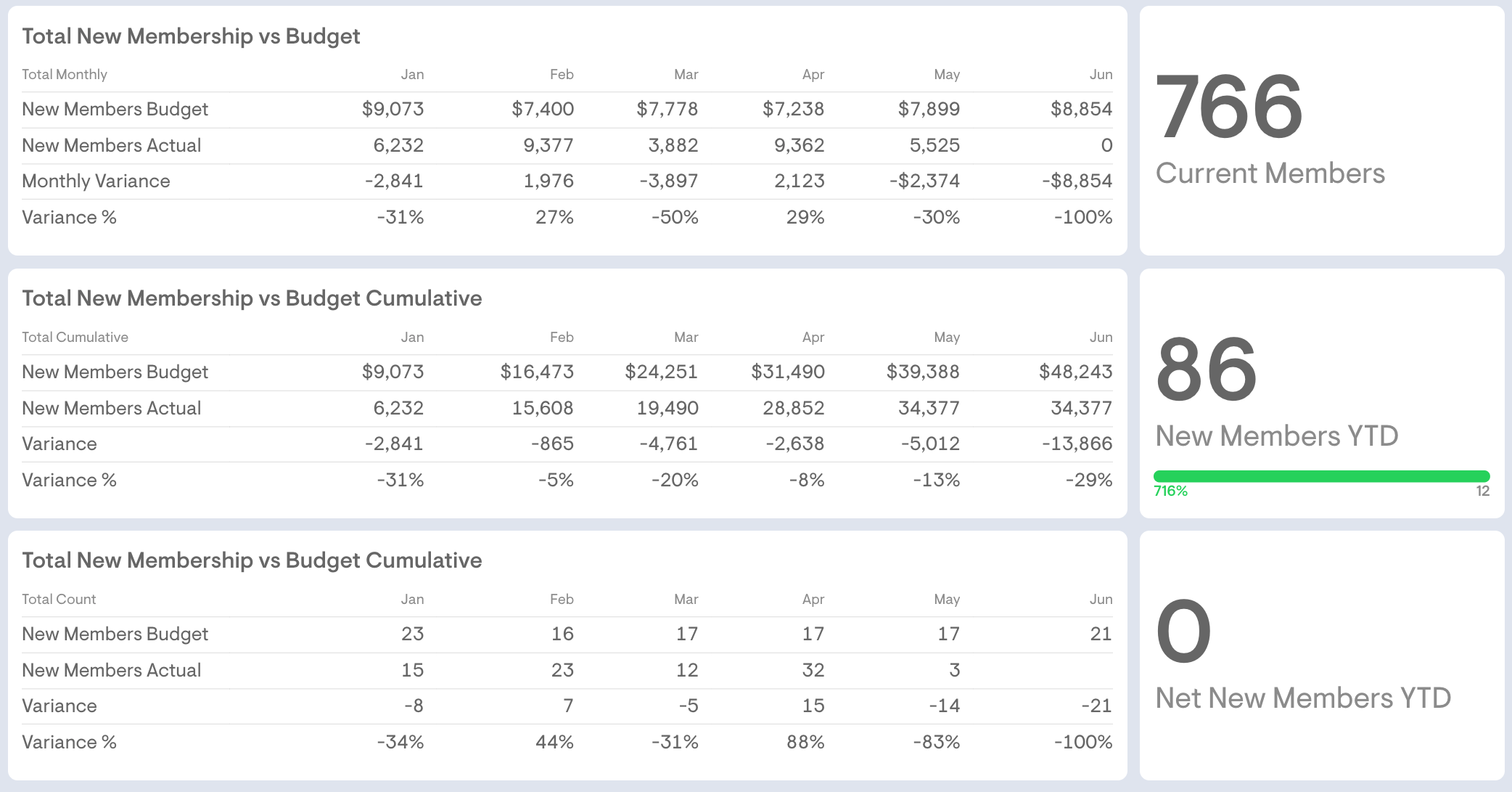
Compares new membership to budget by count and dollars, month by month and cumulatively, with variance in dollars and percent — making it clear at a glance whether growth is tracking ahead of or behind budget.
In a 15-minute call, we'll walk through these examples and show you what your first dashboards would look like — live, in days, not months.